Posts

Image
 My demographic would be B  teacher, creative and media people. It would also appeal to the lower demographics as it is featuring articles and images that represent to the 16-25 year age groups. 

Website research

Image
  Grazzia focuses on dresses of award cereomines and talk about gossip that has happened during the cereomines such as when will smith slaps Chris Rock. They use white plain background which is simple but effective as it means the pictures overlaying this backgroung will not clash as it is a neutral colour. the main content shown on the website is to include celberity news and gossip as well as beauty tips and trick that will appeal the the target audience of 15-24 year olds. The grazzia content is aimed at the younger generation as they have celebrities that are more relatable and they would know. the websites has a high ratio of pictures over text this makes it more engaging, fun and more creative. Grazzia is aimed at younger generation, having visuals such as videos is very important in keeping the audience engaged. 

Video plan for website 2

Image
 

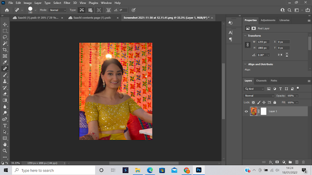
editing my content page image

Image
 In this picture I am editing the image to get rid of the light above her head. I wanted to get rid of the light above her head to make it a proffesional. It is a picture of my cousin and i want to use it for my contents page for my first magazine. i want to use the image to maintain the synergy of the magazine as the front cover is me of in yellow lengha so i wanted to use photo of a women wearing a yellow lengha. 

Mock up of content page

Image
content page (2)  my contents page Above image is my  cover is half way through . I saw Grazia magazine cover green colour was a common theme. This title of my magazine  is very similar to vogue magazine. I wanted green is a pleasant tone it is quite pleasing to the eye. Also green is the colour of royalty so i wanted to use the colour to make my magazine seem more proffesionals and the standard of vogue magazine and grazzia magazine. My photo of my cousin which I edited to make her look like she is on the red carpet.  - w

Task 9 Audience Analysis -demographic and psychographic analysis of your target audience

Interviews at least 3 members of your target audiences a socially conscious 16-25 middle to upmarket demographic about what they would like to have included in your magazine. In your blog post sat what ideas they give you for the magazine. Alexa - vibrant colours  - lovely dresses Ameila - representation of asian culture - fashion  Stella  - celebrities out fits  - make up Austin - fashion show - Lovely dresses Salina - Fashion - vibrant colours  Logan - representation of asin culture  - red carpet looks