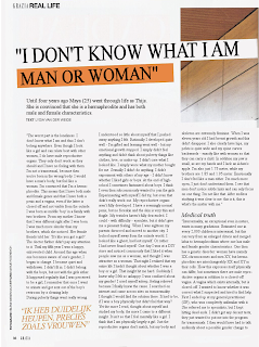
Mock up of content page
my contents page
Above image is my cover is half way through . I saw Grazia magazine cover green colour was a common theme. This title of my magazine is very similar to vogue magazine. I wanted green is a pleasant tone it is quite pleasing to the eye. Also green is the colour of royalty so i wanted to use the colour to make my magazine seem more proffesionals and the standard of vogue magazine and grazzia magazine.
My photo of my cousin which I edited to make her look like she is on the red carpet.
- w


Comments
Post a Comment